Seismic Data with Hydrocarbon indicator CC-BY-SA Joshua Doubek
The final step in the work with seismic data is seismic interpretation. In a scientific field called geophysics, interpretation sounds highly subjective; Very different from the usual statistics, ray and wave phenomenae. This can’t be right, right?
I’d love to say it’s very clear and seismic data reveals a perfect image of the subsurface. But it really doesn’t. Any way we manipulate seismic data has one single purpose, revert the filtering effect of the subsurface on our data. Thinking about all the steps we undertake to clean up our image I am sometimes amazed we can find anything with seismic data at all.
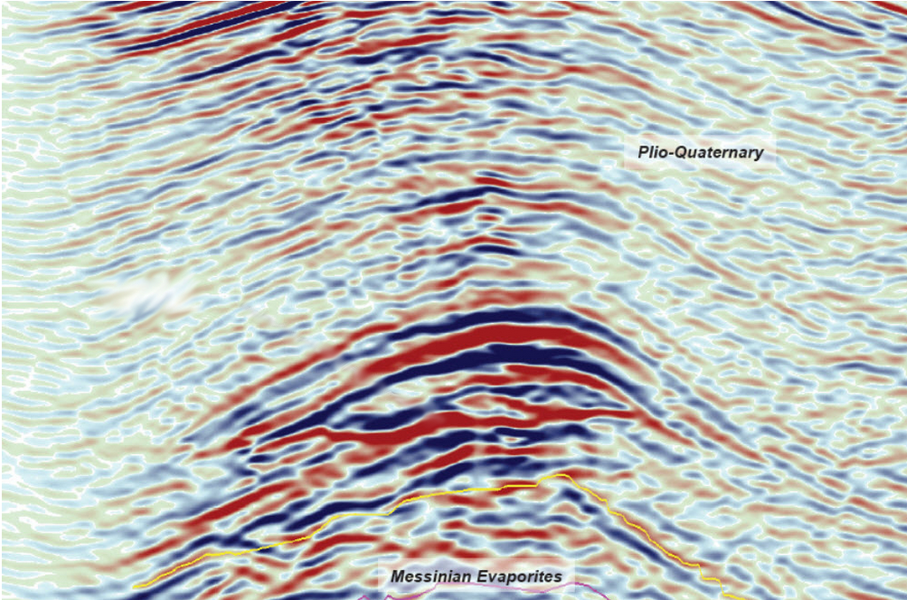
In the end we may be left with something along the lines of this image.
This seismic image is quite good looking. We have low noise levels and pretty good contrasts. We can even see some hydrocarbons on here! At least when you know what you’re looking at.
The upper unit is made up of Pliocene sediments. They’re neatly stacked, which usually indicated some sort of marine deposition regime. Below that is where the magic happens. We see some strong contrasts in a rounded structure. The rounded structure consists of evaporites, which are essentially salt, gypsum or anhydrites. A rounded structure like that is called an anticline and is pretty awesome for the hydrocarbon industry as oil and gas tend to get trapped there and build a reservoir.
Within this anticline structure we see something that doesn’t work geologically. There are two lines crossing. The anticline crosses an almost horizontal line. This indicates that there has to be something else causing this image. These so-called flat spots can be an indicator for a hydrocarbon trap as the fluid in the sediments changes the reflection schematic.
Now the really interesting piece is, that you very probably able to follow this explanation of the flat spot, but there’s a good chance we weren’t looking at the same flat structure. Seismic interpreters looking at the same image will interpret it in different ways. The following image shows how 39 different interpreters took the challenge, generated into a heatmap.
We can explain these phenomenae scientifically, but finding them is still highly subjective. We can see that the heatmap shows many picks along the flat spot I described. This is especially interesting as I posed the challenge to pick the “hydrocarbon indication” instead of directly giving out the challenge “find the flat spot”, giving us many more interpretations.
This is an image taken from the webapp pickthis.io, which was initially started at the geophysics hackathon in Denver, accompanying the SEG. It let’s you take some simple interpretation challenges and you can then compare and vote on other interpretations. Personally, I think this is brilliant practice time before there is actually money to be lost with wrong interpretations.
You can also contribute to it via github. I just implemented a new tagging feature.
Here at The Way of the Geophysicists, we have written about social justice before. Today… Read More
This Friday we're looking at a machine learning state-of-the-art Dashboard and also a new way… Read More
It sure is an interesting time. Apologies I kept you waiting with more Friday Faves,… Read More
Aaaand it's gone. It's starting out with one of my new projects and then a… Read More
I'm starting a new project, where I take concepts from machine learning for science and… Read More
It's the holiday season, so let's keep this Friday Fave short, with a fave that… Read More